Basic_matplotlib_with_iris
python plot(1)
iris데이터를 사용하여 plot에 대해 공부해보도록 하겠습니다.
원글은 https://unfinished-god.com/2019/03/01/r-plot%EC%97%90-%EB%8C%80%ED%95%9C-%EC%9D%B4%EB%AA%A8%EC%A0%80%EB%AA%A8/
에서 가져왔고, 위 글에 써진 R 코드를 python으로 바꿔서 글을 쓰도록 하겠습니다.
STEP 0 .Plot을 구성하기 위한 data 만들기
import numpy as np

from sklearn.datasets import load_iris

iris = load_iris()
iris dataset은 붓꽃의 3가지 종에 대해 꽃받침sepal과 꽃잎 petal의 길이를 정리한 데이터입니다. 이해하기 쉬우며 크기도 작고, Classification에 적합하기 때문에 여러 machine learning 분야에서 자주 사용되고 있습니다.
데이터는 다음의 링크에서도 다운로드 받을 수 있습니다. https://archive.ics.uci.edu/ml/datasets/iris
dir(iris)
['DESCR', 'data', 'feature_names', 'target', 'target_names']
dir()함수는 어떤 객체를 인자로 넣어주면 해당 객체가 어떤 변수와 메소드를 가지고 있는지 알려줍니다. 데이터를 대략적으로 탐색할 때 사용합니다.
#iris
iris.feature_names #column 이름
['sepal length (cm)',
 'sepal width (cm)',
 'petal length (cm)',
 'petal width (cm)']
sepal_length = iris.data[ : ,0]
sepal_width = iris.data[ : ,1]
petal_length = iris.data[ : ,2]
petal_width = iris.data[ : ,3]
STEP 1. 기본적인 plot함수
가장 기본적인 plot함수입니다. plot함수는 x와 y의 2개 축을 기준으로 좌표 찍듯이 그리는 컨셉을 가진 함수입니다.
기본적인 그래프를 그리기 위해서는 matplotlib.pyplot에서 plot(x,y)를 사용하면 됩니다. x와 y는 각각 x축과 y축의 값이 됩니다.
import matplotlib.pyplot as plt
%matplotlib inline
plt.plot(sepal_length)
plt.show() # 일반 파이썬 인터프리터로 가동되는 경우를 대비해 show명령을 실행합니다

STEP 2. 점 찍기
‘o’ 는 circle marker를 나타냅니다.
maker의 종류 등에 대해서는 아래 블로그를 참조했습니다. https://bcho.tistory.com/1201
plt.plot(sepal_length ,'o')
[<matplotlib.lines.Line2D at 0x224a9fbe198>]

STEP 3. 점의 형태 변경해 보기
plt.plot(sepal_length , '*')
[<matplotlib.lines.Line2D at 0x224b4eb6828>]

STEP 4. 점의 크기 조정해 보기
markersize를 이용해 점의 크기를 조절할 수 있습니다.
plt.plot(sepal_length , 'o ',markersize = 8)
[<matplotlib.lines.Line2D at 0x224b4f1f128>]

이 밖에도 직선의 두께, 색깔 역시 조절할 수 있습니다. 색 속성을 추가하면 됩니다.
색 속성이 먼저 온다는 사실 주의하시기 바랍니다!
plt.plot(sepal_length, 'g', linewidth = 10)
[<matplotlib.lines.Line2D at 0x224b4f7f860>]

STEP 5.그래프/X,Y축에 제목 넣기
X,Y축에 제목을 지어줍시다. 이를 설정해 표현시 그래프에 직관성과 가독성을 더해줄 수 있습니다.
그래프를 그릴 때 그래프의 title과 x,y축의 label을 표시하기 위해서는 title은 plt.title(“타이틀명”) X,Y축에 대한 label은 plt.xlabel(‘X축 라벨명’), plt.ylabel(‘Y축 라벨명’)을 사용합니다.
plt.plot(sepal_length)
plt.xlabel('index')
plt.ylabel('sepal_length')
plt.title('sepal_length')
Text(0.5,1,'sepal_length')

STEP 6. 선 추가(가로선/세로선)
plt.axhline()로 가로선을 그립니다. y값으로 6.0을 설명선으로 잡았습니다. 색상과 선의 두께를 지정할 수 있습니다.
plt.axvline()으로 세로선을 그릴 수 있습니다.
plt.plot(sepal_length)
plt.axhline(y = 6.0, color ='r', linewidth =1)
plt.axvline(x= 60, color = 'r', linewidth =1)
plt.show()

STEP 7. 선 추가 (1차함수)
아까 그린 그래프에 y=2x+3이라는 1차함수를 추가해 봅시다/
1차함수를 추가하기 위해서는
plt.vlines(x,ymin,ymax,colors=’k’,linestyles=’solid’,label =’’)
라는 함수를 사용하면 됩니다. 각 변수의 의미는 다음과 같습니다.
x : lines를 어디에 plot할지 위치를 결정
ymin,ymax: each line의 시작과 끝
같은 방법으로 2차함수도 추가해 봅시다.
plt.plot(sepal_length)

plt.vlines([50,120],4.5,8.0, colors = 'r')

x = np.arange(0,150,0.01) # 시작, 끝, the distance between two adjacent values
y =0.025*x +3
plt.plot(x,y)
[<matplotlib.lines.Line2D at 0x224b6022ac8>]

plt.plot(sepal_length)
plt.vlines([50,140],4,7.0,colors ='g')

x = np.arange(0,150,0.01)
y= 0.0005*x**2 +3
plt.plot(x,y)
[<matplotlib.lines.Line2D at 0x224b608ccc0>]

STEP 8. 선을 추가 해보자(회귀식 사용)
회귀분석(regression analysis)은 D차원 벡터 독립변수 x와 이에 대응하는 스칼라 종속 변수 y간의 관계를 정량적으로 찾아내는 작업입니다.
x축과 y축에 각각 speal_length와 petal_length를 입력하여 그래프를 그리고 점들에 대해 회귀 분석을 해보자.
Liner Regression model
y = xB + c + e
x data
B coefficients
c intercept
e error,cannot explaines by model
y target
from sklearn.linear_model import LinearRegression
#modeling step 1. set up the model

model = LinearRegression()

#2. use fit
#fitting하여 선이 되기 위한 최적의 장소를 찾습니다.
model.fit(sepal_length.reshape(150,1), petal_length)

#3. check the score
# 우리 모델의 R**2값입니다. 이는 coefficient of determination(결정계수)이며
# 추정한 선형 모형이 주어진 자료에 적합한 정도를 재는 척도입니다.

model.score(sepal_length.reshape(150,1),petal_length)
0.7599553107783261
B =model.coef_
c =model.intercept_
구한 coef(기울기)와 intercept(y절편)을 이용해 y직선을 x= 4부터 x= 10까지 그려 봅시다.
plt.scatter(sepal_length,petal_length)

plt.xlabel('petal_length')
plt.ylabel('sepal_length')

plt.title('Linear Regression')

plt.plot([4,10],[4*B +c ,8*B+ c],'g')
[<matplotlib.lines.Line2D at 0x224b63664a8>]

STEP 9. 여러 개의 그래프를 한 화면에 그려보자
한 화면에 여러 개의 그래프를 그리려면 figure함수를 통해 figure객체를 먼저 만든 후subplot메서드를 통해 그리는 개수만큼 subplot을 만들면 됩니다.
subplot의 개수는 add_subplot 메서드의 인자를 통해 조정할 수 있습니다. (2, 1, 1)은 2x1(행x열)의 subplot을 생성한다는 의미이고 세 번째 인자 1은 생성된 두 개의 subplot 중 첫 번째 subplot을 의미합니다. 마찬가지로 (2, 1, 2)는 2x1 subplot에서 두 번째 subplot을 의미합니다.
fig = plt.figure(figsize=[10,7]) #width,height in inches
plt.title('iris dataset')

plt.subplot(2,2,1)
plt.title('sepal_length')
plt.plot(sepal_length)

plt.subplot(2,2,2)
plt.title('sepal_width')
plt.plot(sepal_width)

plt.subplot(2,2,3)
plt.title('petal_length')
plt.plot(petal_length)

plt.subplot(2,2,4)
plt.title('petal_width')
plt.plot(petal_width)
[<matplotlib.lines.Line2D at 0x224b6d2e860>]

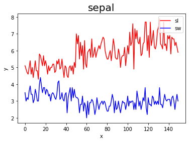
STEP 10. 그래프 겹쳐 그리기
그래프를 그릴 때 여러 개의 그래프를 같이 그릴 수 있는데, 이 경우 각 그래프가 구분이 안 되기에 그래프마다 라벨을 달고 이 라벨명을 출력하는 것을 legend라 합니다.
legend를 사용하기 위해서는 plt.plot에서 label변수에 그래프의 이름을 정의하고, plt.legend(‘위치’)를 정해주면 legend를 그래프상에 표현해줍니다.
plt.plot(sepal_length,'r',label = 'sl')
plt.plot(sepal_width,'b',label ='sw')

plt.xlabel('x')
plt.ylabel('y')
plt.title('sepal',fontsize =20)
plt.legend(loc='upper right')
plt.show()
STEP 11 . 그래프를 코드를 이용해 자동으로 저장해 보자
plt.savefig를 이용해 그래프를 저장할 수 있다.
plt.plot(sepal_length)
plt.savefig('sl.png',dpi = 100)#dpi는 그림의 크기

from matplotlib.image import imread #이미지 불러오기
img = imread('sl.png')
plt.imshow(img)
plt.axis('off')#저장했던 그래프 위로 새로운 그래프의 좌표축이 생겨 새 그래프의 좌표축 지움
(-0.5, 599.5, 399.5, -0.5)
